

PROJECT BRIEF
For this project, my client - a highly trained cave diver - was in need of a simple and versatile logo for his start up SCUBA company that could be used as decals for diving equipment, embroidery or screen prints on clothing, and possibly an outdoor business sign in case he is to ever open a brick and mortar store front.
He wanted a logo that would appeal to adults who are divers or want to become divers, as well as showcase the safety he would provide his clients, as diving can sometimes be nerve wrecking.
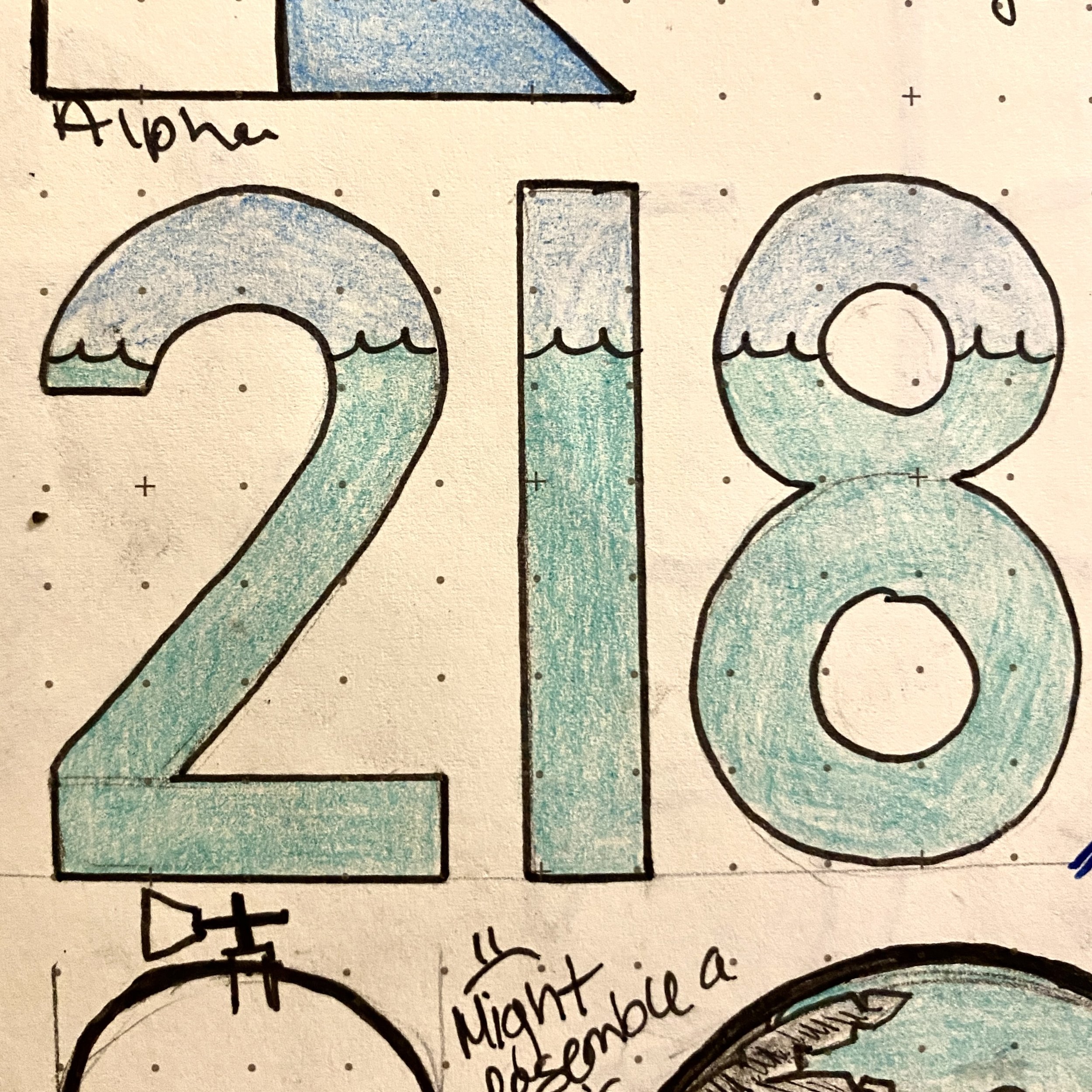
THUMBNAIL SKETCHES
Visual brainstorming.


LOGO INSPIRATION
After many thumbnail sketches utilizing symbols found within diving such as oxygen cylinders, dive flags, marine life, etc. And after reviewing some feedback from the client, I did some research on diving markers used by cave divers. These are plastic glow in the dark markers that cave divers hook to their lines, so they can navigate the dark caves. They come in a few interesting shapes; for this project I was drawn to the arrow shaped marker. We chose to use this symbol within the logo for the following reasons:
Cave divers & technical divers are some of the best and most experienced divers. This symbol would be recognizable to them, and they would immediately have a sense of the business owners higher level of experience.
While the dive marker may not be recognizable to non-divers, if could act as a conversation starter for potential clients. Our use of good design principles such as spacing, kerning, and legibility and our focus on simplicity is how we chose to showcase safety within the logo mark.
When the two cave markers are paired the way they are in the logo I created, they create a “2” and an “S” monogram and their negative space also creates the composition of the American dive flag.


Seamless Instagram Carousel Post


